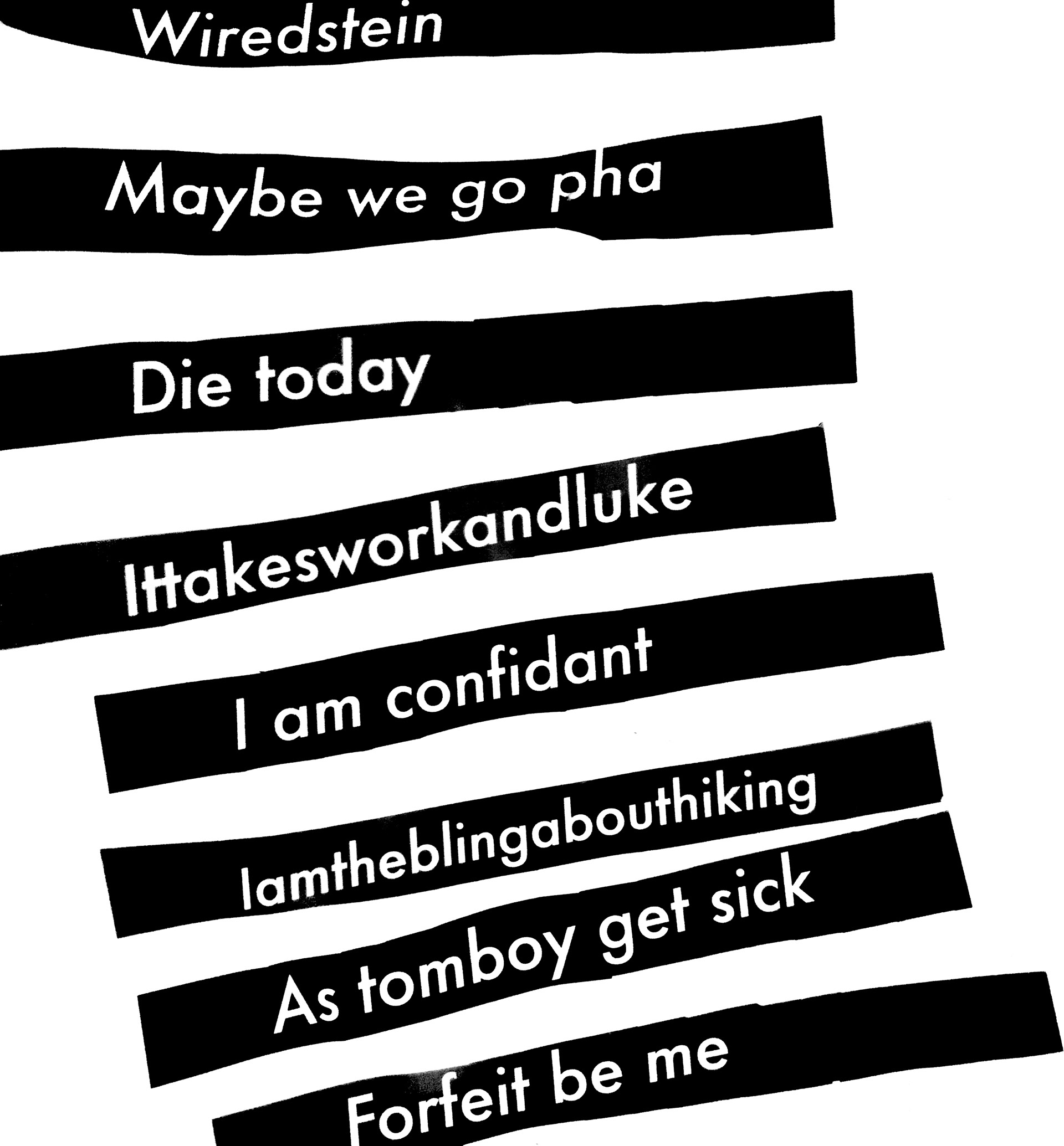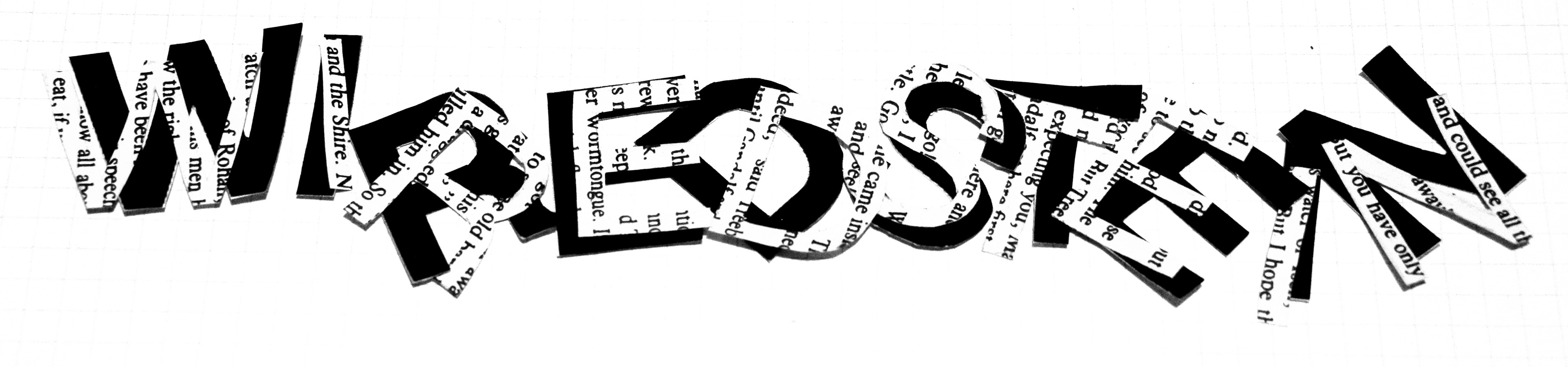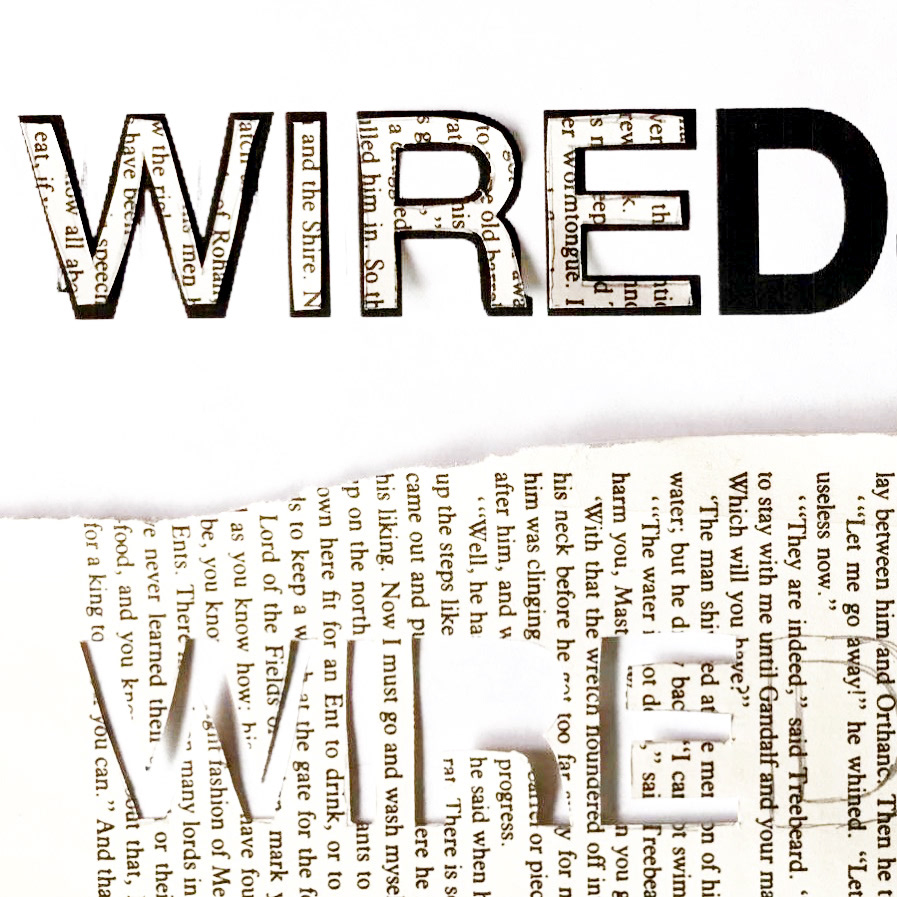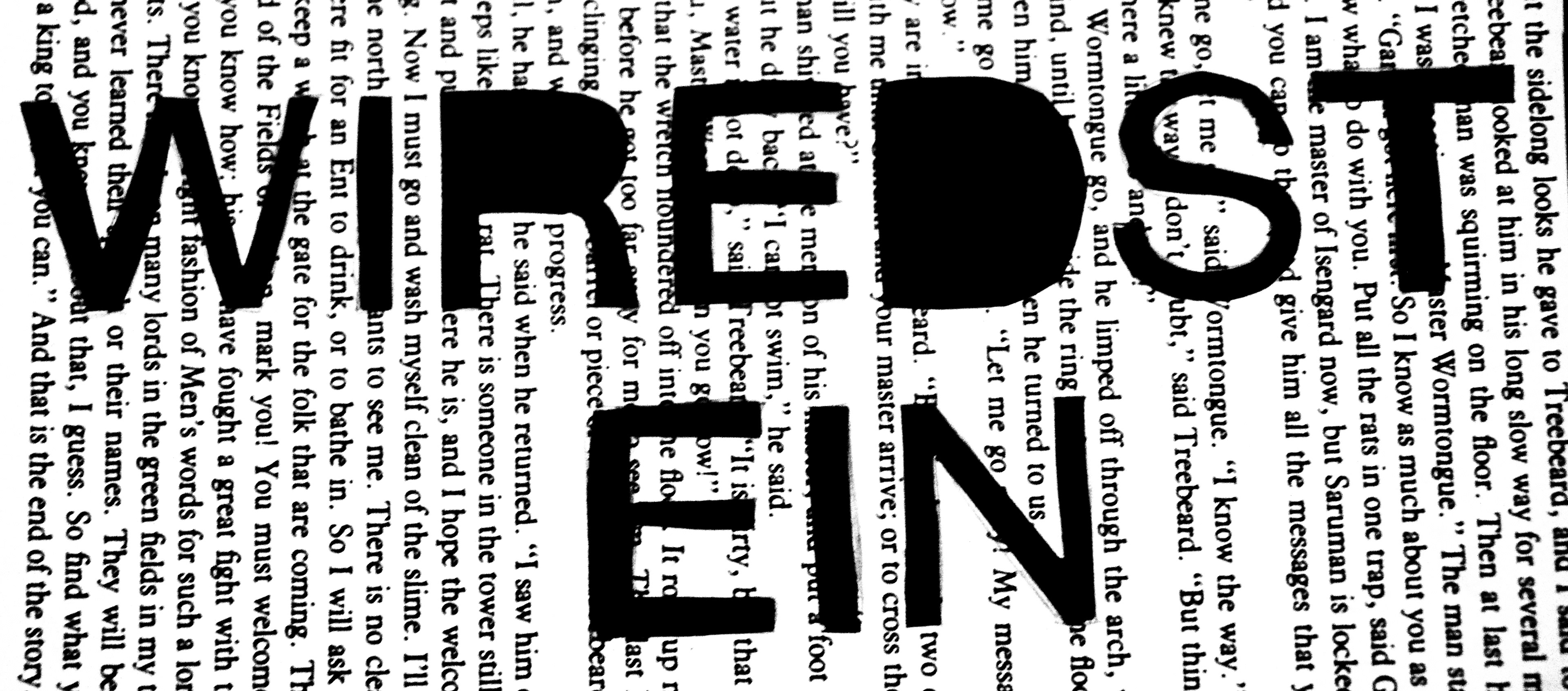
I created this experimental typographic zine inspired by autocorrections sent to me by my father. I defined “Wiredstein” as a life philosophy that adopts the adoration of small, imperfect details resulting in a more positive outlook on life. I sought to explore this philosophy within my zine. The cover is a photograph of a page taken from J.R.R. Tolkien’s Two Towers that I physically printed on top of.
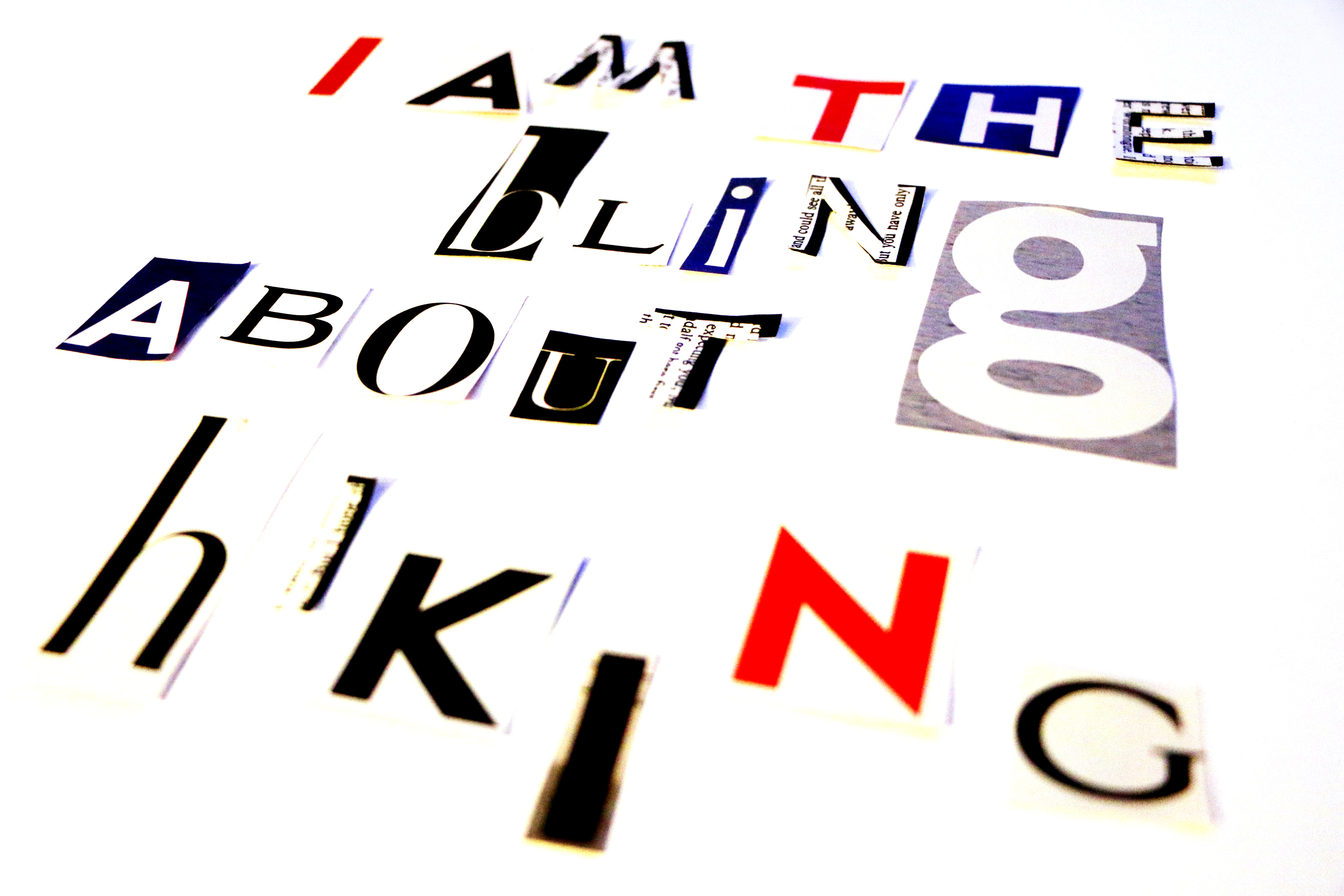
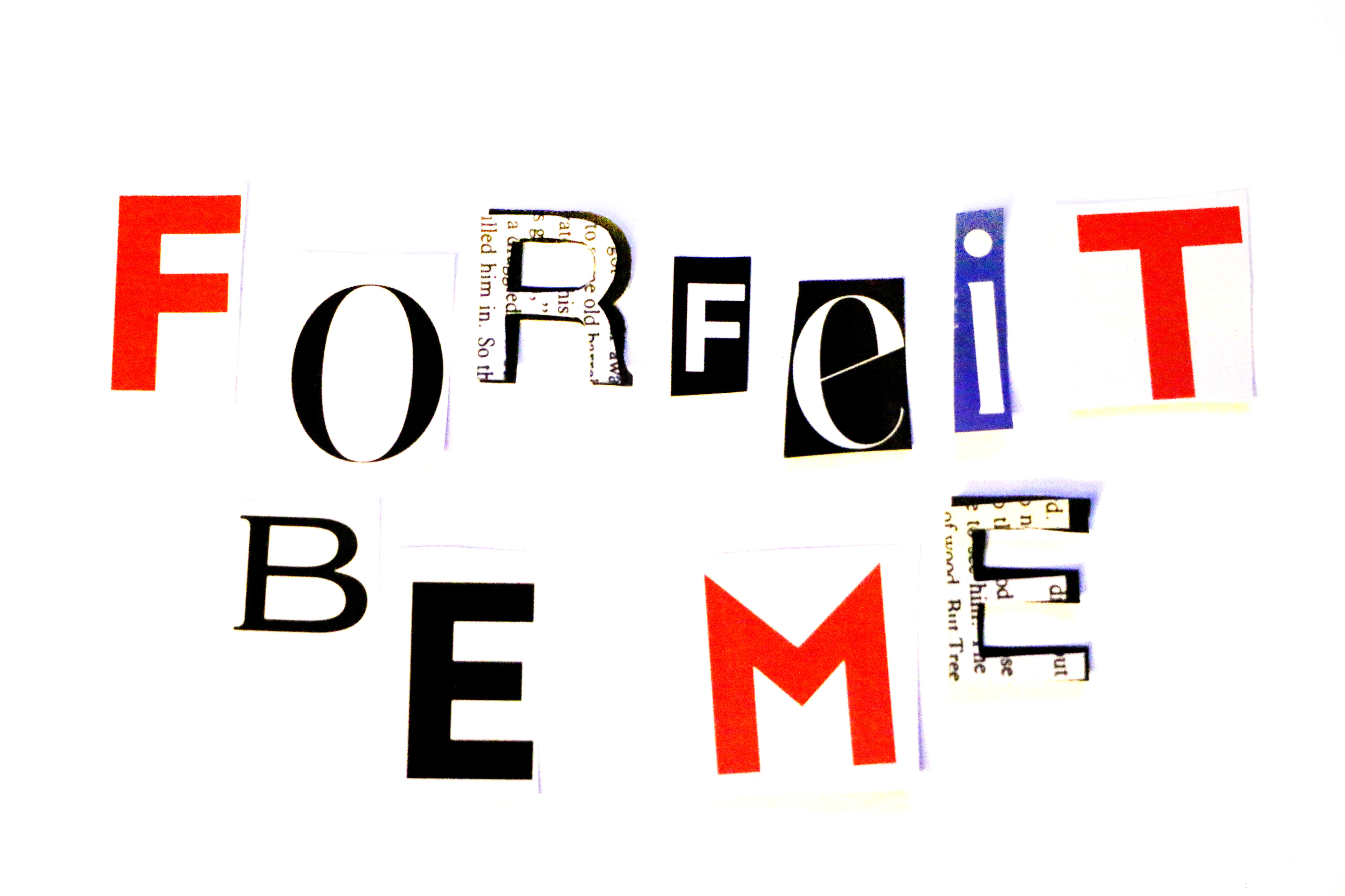
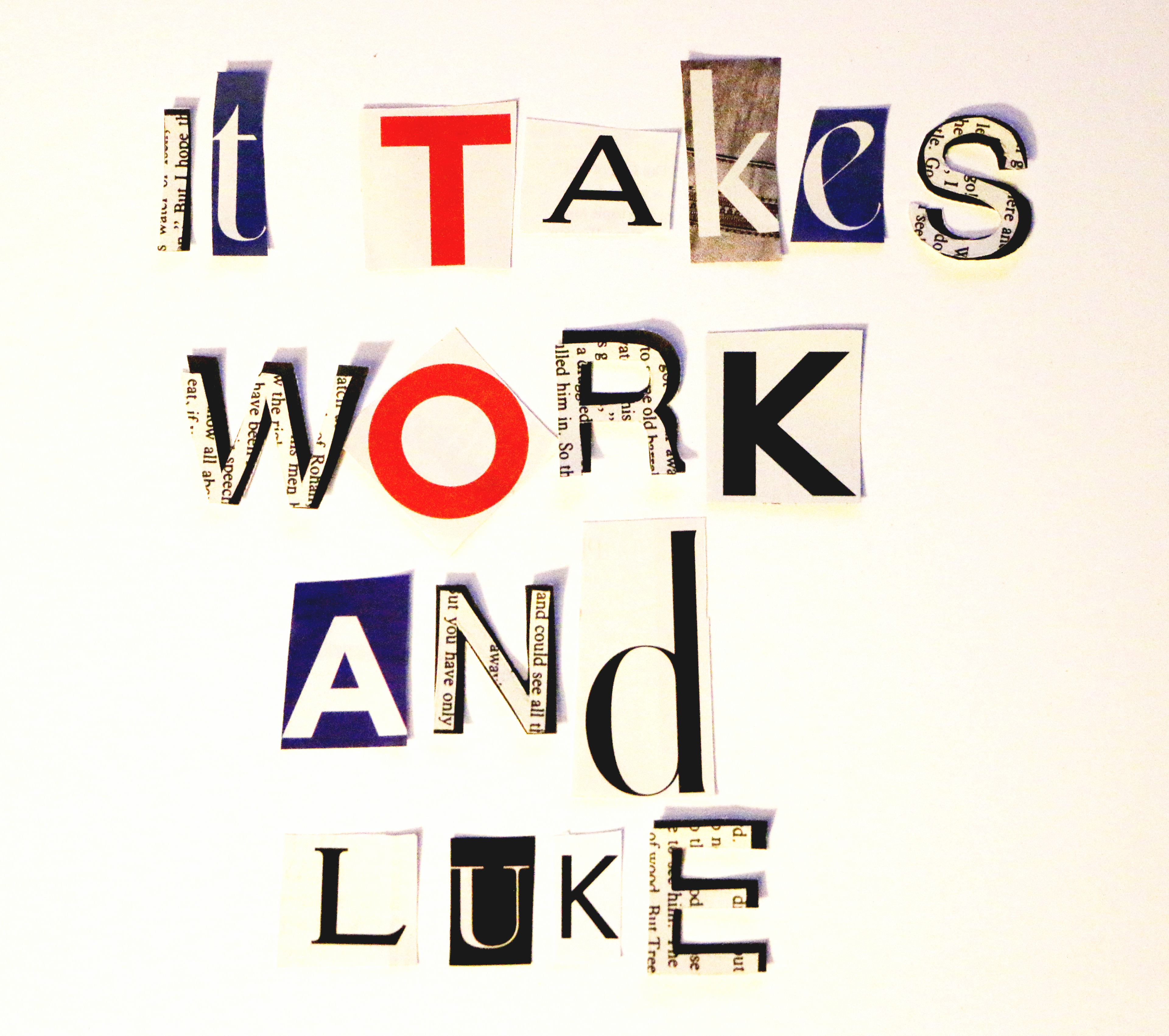
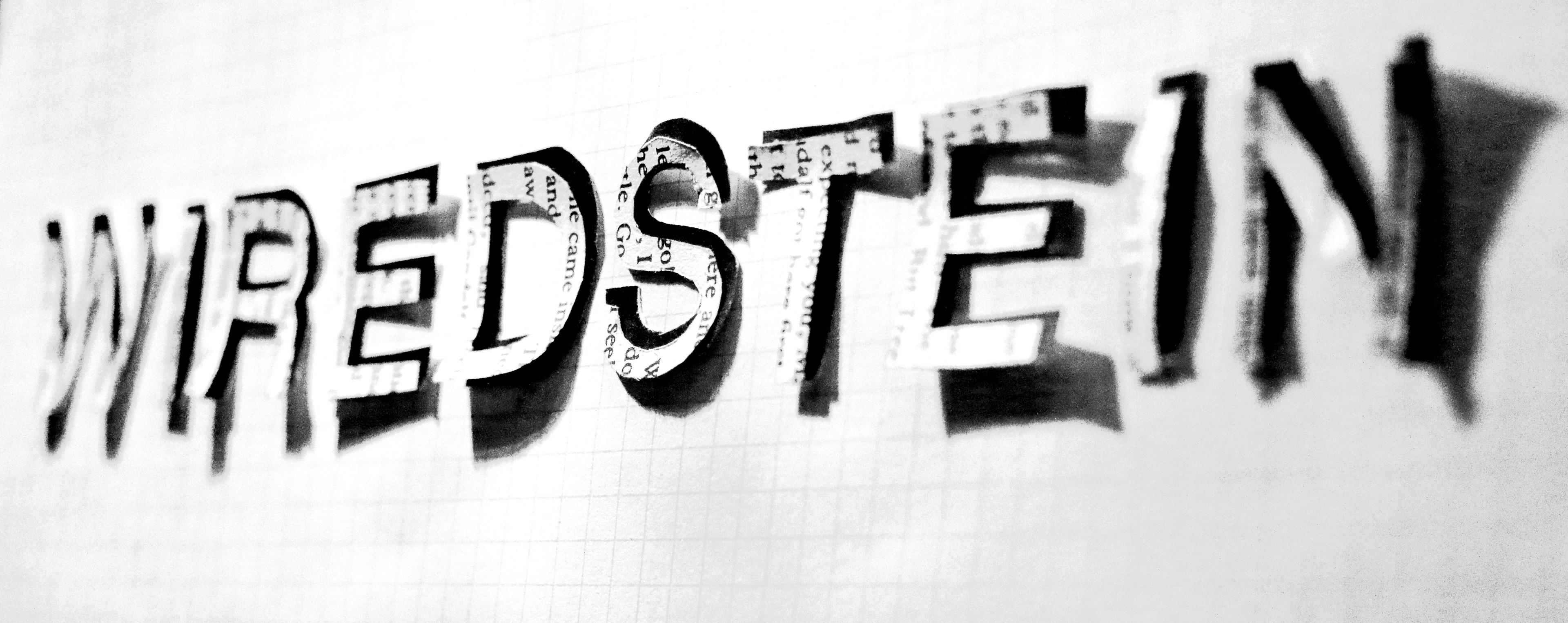
A “Wiredstein” stencil was created during the process of hand cutting letters out for other pages within the book. In order to create the other experimental elements within the book, I cut out hundreds of words from magazines and selected a mix of serif and sans serif typefaces that stood out to me. A major problem I faced with this project was unifying the pages so they appeared as one continuous line of thought. This was overcome by creating spreads in InDesign that shared colors with the more experimental spreads.
The zine was selected to be published in the Spring 2019 edition of the Metrosphere, MSU Denver’s student-run arts and literary magazine. I continue to add this zine to more projects to deepen the book-within-a-book concept.